Cutting the Cord and Liking it, Mostly.
Recently I cut the cord and cancelled my cable service. I did this because I realized I could watch the same shows that I watch on cable and save in excess of $50 per month by choosing Hulu (No Ads) + Live TV. While this has been a positive decision to get rid of the cable dependency and not need to use all of their bulky rented equipment, it has had at least one major drawback. Hulu Live has a very poorly designed interface. It’s a clunker. It’s unintuitive, requires many more clicks than necessary to achieve basic viewing tasks, and hides things you might really want from you.
Here, I will break down the issues one by one.

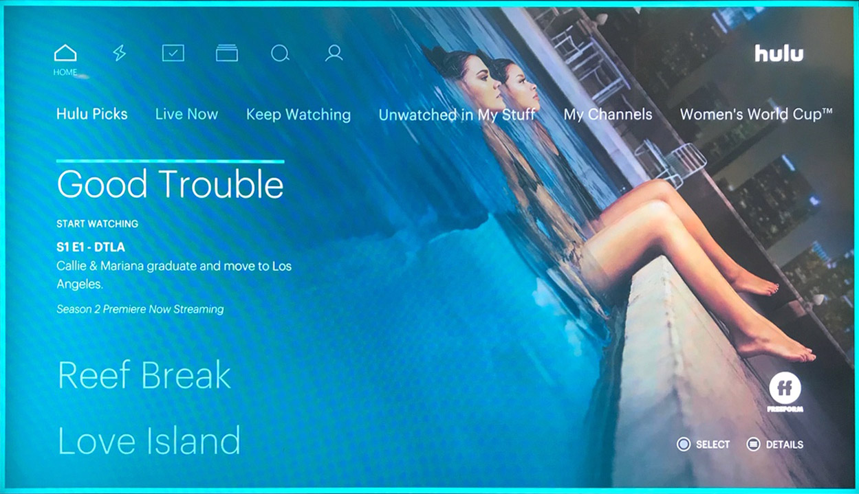
The Hulu Home Screen. This is what you first see when you start Hulu.
Where is the Channel Guide? I Can’t Find it!
It’s a fair assumption that the channel guide is heavily used when surfing tv. All signs point to the fact that Hulu didn’t really consider this when creating their live interface. Upon first using the service and choosing Live TV, I couldn’t find the channel guide anywhere. This was because there was no indication or coach mark to find a guide. Nothing. I was in a navigation void. I knew there must be some kind of guide, so I persisted. After some experimenting, I learned that clicking the down arrow on the remote would bring me to the channel guide.
Recent Channels vs All Channels – How Are They Sorted?
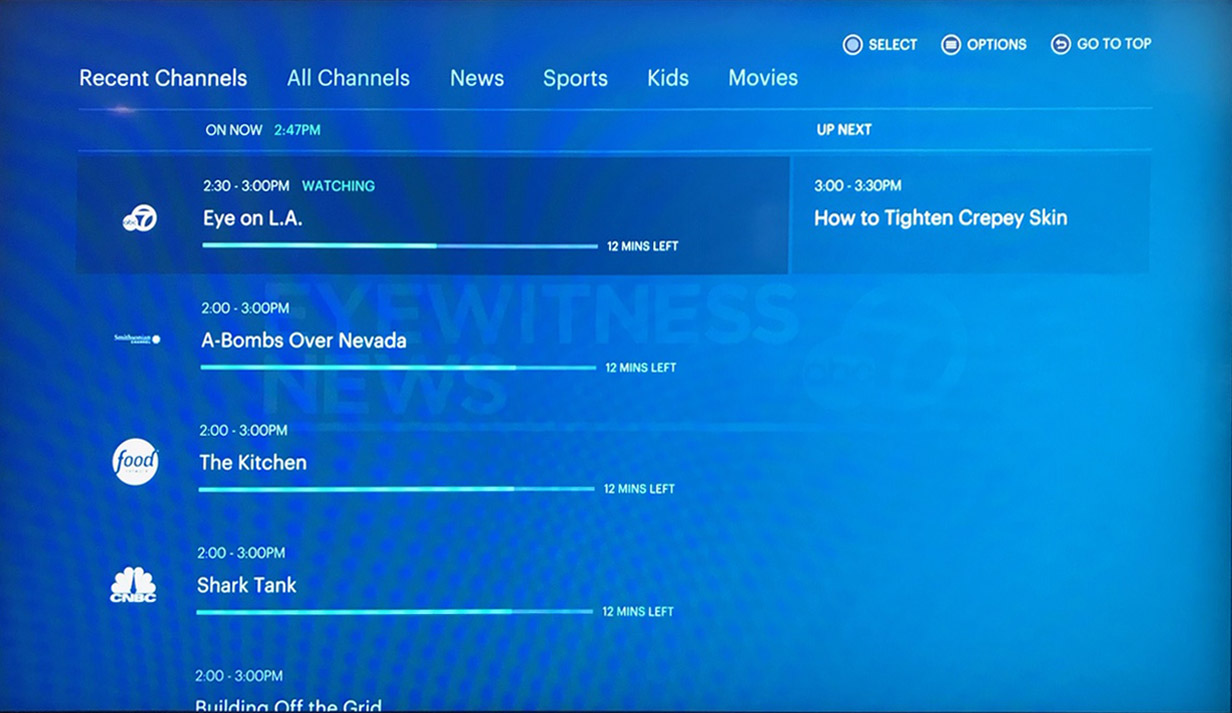
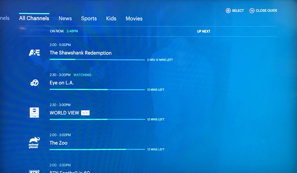
Hulu Live TV breaks up the live menu in the following order: Recent Channels, All Channels, News, Sports, Kids. I find myself using the first two options the most. The issue here is that the interface for Recent Channels and All Channels is confusing because they look nearly identical in layout, but there is no indication to show how the sorted channels are listed from top to bottom. As best as I can tell, Recent Channels displays the channels in the order they were last viewed, and All Channels displays the channels in Alphabetical order of network name. I think the intention here is to be helpful by sorting Recent Channels in the order you last viewed, to make it convenient to go back to your channels, but really, it’s just confusing because All Channels is sorted alphabetically, but looks exactly the same.

This is the page for Recent Channels.

Nearly Identical to Recent Channels, All Channels shows the channels in Alphabetical order with hard to read logos.
So What’s on Tonight? Good Luck Finding Out.
Watching Hulu Live and using the channel guide is limiting to use because the only information you will find about future shows is the one upcoming show to be shown on a given network. For users of cable and satellite systems who are used to being able to scroll many hours or even days into the future to see what is going to be shown, this feels like a major step backwards. I have never seen any cable or satellite service offer such a limited guide. As you’ll see below, there is some information about scheduling, but it’s completely buried and not where you think it should be.
How Was the Channel Guide Designed?
If I was to guess how the channel guide was created I would say that a bunch of screenshots were put together and pitched in a meeting where a bunch of Hulu Execs were dazzled “Look how clean the screens look.” and “Look how they let the screens breathe by not crowding them.” Ok yeah, it looks nice… but it’s a bear to wrestle with, and it doesn’t get much easier with time.
– Most of the screen real estate is used to give space for the progress bar of the length of the show.
– The logos are small and hard to read, making is a little difficult to scroll quickly through the networks.
– Want to know more about a show? Is there anything on the screen to help you with that? No, or course not. We need to keep the screens clean, right? Ugh!! Getting more info requires clicking the hamburger button. This is only discovered by experimentation, assuming you haven’t given up in bitter exasperation. 🙁
– When you finally discover how to get more info about a show, you only see the show’s episode number, episode name, and synopsis. Cast and year are missing. Who’s in it? When was this show made? Hulu doesn’t care, and neither should you, apparently.
– It’s hard to see what time it is. The live clock is really small, and feels almost hidden, which is weird because most people use the live clock to know when a show is going to be on.
Want to Go Home? That’s Easy… Leave and Come Back.
There is not easy way to get back to Hulu home, once you are down a navigation path. Clicking “home” using my setup on Amazon Fire TV sends me back to Amazon Home, and then I have to click back into Hulu to get back to Hulu home. It feels unusual that leaving the service for a moment is often the fastest way to get back to the homepage of the service.
Scheduling, I Know it’s in There Somewhere
One path I found for finding Network schedules is by clicking Browse>Networks>Category(Entertainment)>Network Name (4 Clicks). Why does it take 4 clicks to see what’s home up next? I don’t know. But when you do get there, the display shows what’s upcoming on that network for the next 24 hours. Clicking on a show (one more click) gives the Episode Number, Episode Name, Synopsis, the run time length, parental rating, category tags, and the year (which was not available in the live tv show info.)
Is it Worth It?
Ok so Hulu Live is not easy to use, and doesn’t get much easier in time, except that you have some knowledge of where things are hidden or buried. I’m hoping that over time Hulu will address these issues because the service actually is very good otherwise. I have read reports there used to be buffering issues in earlier years, but it seems performance issues have been ironed out. The content is high quality, and matches what I actually watch, so I find it worth dealing with some usability issues until Hulu improves them.
In my next article, I will be show my solutions how for how to improve these issues.
Leave a reply