You’ve Come a Long Way, Baby
It’s been much longer than I expected to write this follow-up article, but this has given me plenty of time to use the Hulu service and allow for them to release several updates.
By far the best feature that has been updated is the Channel Guide, which is now scrollable and displays upcoming shows well into the next several days. As I pointed out in my previous article, A UX Review of Hulu Live, the ability to only see what is playing next did not provide enough information to satisfy someone who is looking a few hours ahead to see what is available to watch. The Channel Guide now fits the mental model of what people expect for a channel guide, and this makes the whole experience feel easier and familiar to use.
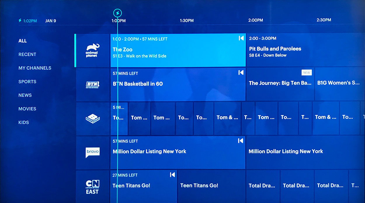
Hulu’s updated channel guide is now scrollable and makes the current time very clear.
With the introduction of the new Channel Guide, a few other issues have been improved as well:
Size of Clock – While the clock doesn’t appear to be different in size, the position of it now feels more obvious, and the timeline spans across the entire top of the screen. The timeline uses a generous amount of real estate to not only communicate what time it is now, but what time span is being covered. The result is that the user can’t help but notice generally what time is being covered, and their eyes can intuitively track to the beginning of the time span where the clock is.

Redesign of Show Progress Bar – In the older interface, each show had a long progress bar to visualize what percentage of the show had been completed. While progress bars are appropriate for watching something load, the visual metaphor doesn’t really translate as well to television. Users are much more used to seeing a timeline which indicates the exact time, and how far along all shows are against that timeline. The Channel Guide now does this elegantly and provides a much clearer way of viewing a timeline for channels.
There’s Still Some Kinks to Iron Out
Small Logos – Some of the logos in the channel guide are still so small, they can’t be read when seated a few feet away from a viewing screen.
Always Logging Out of Hulu – This comment is specific to using Hulu on a device such as Fire TV. The “home” button on the remote leads to the Amazon Home, not the Hulu Home. As far as I can see there is no way to navigate home, other than clicking the back button (sometimes multiple times). One fix could be to have a persistent home button on the screen.
Scrolling Far Ahead – It’s now easy to scroll ahead with the Channel Guide, but it’s tiring to sit and wait to scroll a day or two ahead. It would be nice if there was a button or double click method for scrolling a day ahead at a time.
Unable to Scroll to Top Quickly – Similar to the problem with scrolling forward on the Channel Guide, if a user scrolls vertically far down a list, there is no quick way back to the top of the screen. A double click or button would again be an easy remedy.
Lockup/Restart – It seems that almost every viewing that is over an hour results in a Connection Error. This requires a complete restart of the Hulu App and can take about 30 seconds every time it happens.
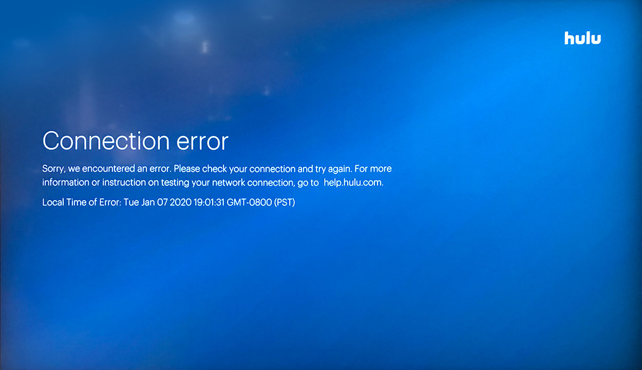
Almost every session of watching that last beyond in hour results in this Hulu version of the “Blue Screen of Death”.
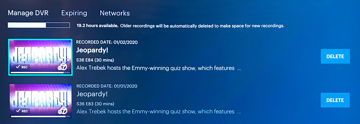
Deleting is Difficult – Currently there is no way to delete multiple recorded episodes of a show. I record “Jeopardy” every weeknight. To delete these episodes, I have to click delete, confirm, and wait for each episode to delete. This is time consuming and tedious. A much better and more conventional solution to this issue would be to arrange episodes of the same program together in a folder, so that an entire folder can be deleted at a time. Another option would be to have check boxes next to episodes, and allow for multiple deleting, much the same way someone deletes multiple emails.
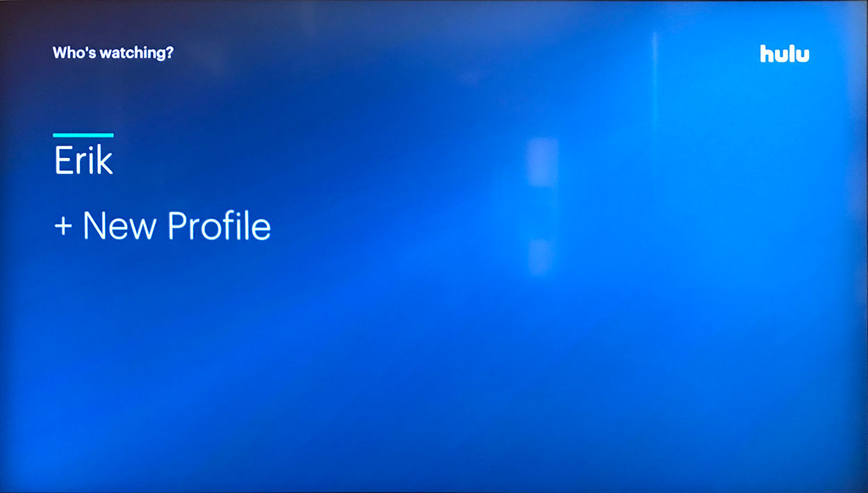
I Keep Seeing My Name, Why? – Very often when I start Hulu I have to confirm my name as the user of the app even though I am the only user of the app. I see the benefit of this screen if there is more than one user, but if there is only one user, this is just a wasted screen. Adding a second user could be inserted under the Settings menu instead of being placed before the home screen.
Does Like/Dislike Do Anything? – There is an option to like or dislike an individual show. Unfortunately, there is not any screen or feature that serves up obvious results to these preferences. It is possible that these preferences are tracked and factored into the programs that Hulu Suggests, but there is nothing that says “Because you liked that…. We suggest this….”. Currently this provides no motivation to continue liking or disliking shows.
The Verdict
After more than half a year of using Hulu (No Ads) + Live TV, I am happier with the service than when I first reviewed it. The scrollable Channel Guide was key in making Hulu feel more like a standard cable or satellite service that I had left, due to cost. Despite several nits I mentioned above, I have no plans to move away from Hulu currently. None of the problems that continue to exist take enough way from the experience that I would want to look for a new solution. My overall satisfaction with the service is high. Well done, Hulu.
Leave a reply