Equator BPO (Broker Priced Opinion) Integration
The Challenge:
- Create an alternative way for agents to enter BPO long from data. Current use was PDF offline
- Find a way to make a very long form manageable, easy to use, and able to save work
- Use modern form practices to make a form that is in line with current use expectations
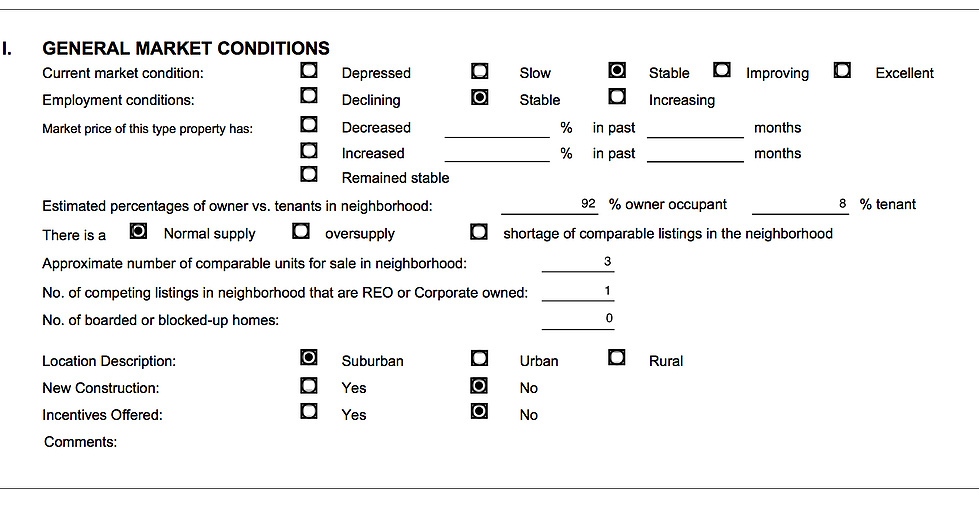
Small portion of original pdf version of BPO. This had to be filled out manually offline, then uploaded.
Form Research and Form Patterns
To create a form that would be several pages long with hundreds of fields that would be easy to use would take some deep understanding of how forms worked best. The strategy I created was to create a “Best Of” list for creating forms as a starting point.
After approximately a week of research I established my list:
1. Make easy to scan
2. Alignment and simplicity – eases the eye
3. Inline Error handling – points exactly where the error is. Says what the error is
4. Field is appropriate to data length
5. Complete button CTA stands out
6. Use example text – gives good samples of what to fill out
7. Long forms must be divided up to avoid attention fatigue
8. Use focus to show which field is active
9. Keep labels on screen after data is filled in – people can check their work
10. Make form fit media and work on media size
11. Group Related information
This list would guide me to create something that users would be able to understand and use easily because it’s based on years of findings about how people use forms best.
Along with my Equator colleague, Jon Green, we established a design pattern library as the fist step of how our forms should look and behave.
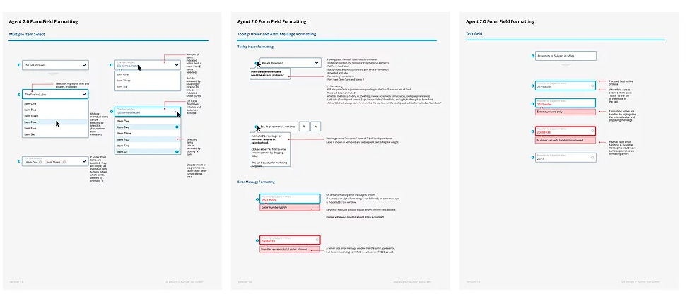
Sample pages from pattern library
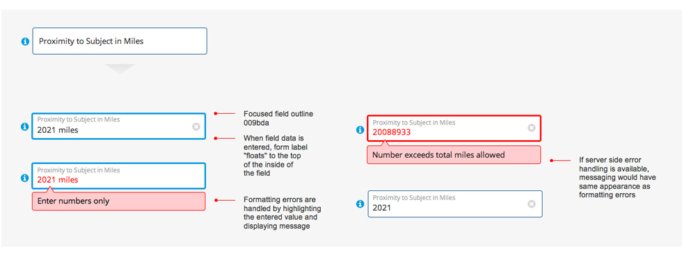
One of the most modernizing features in the persistent inline label. The label moves up when the field is in focus, but never disappears. This ensures that the person who is working on the form never forgets why they entered their data in a given field. It also helps streamline the page significantly.
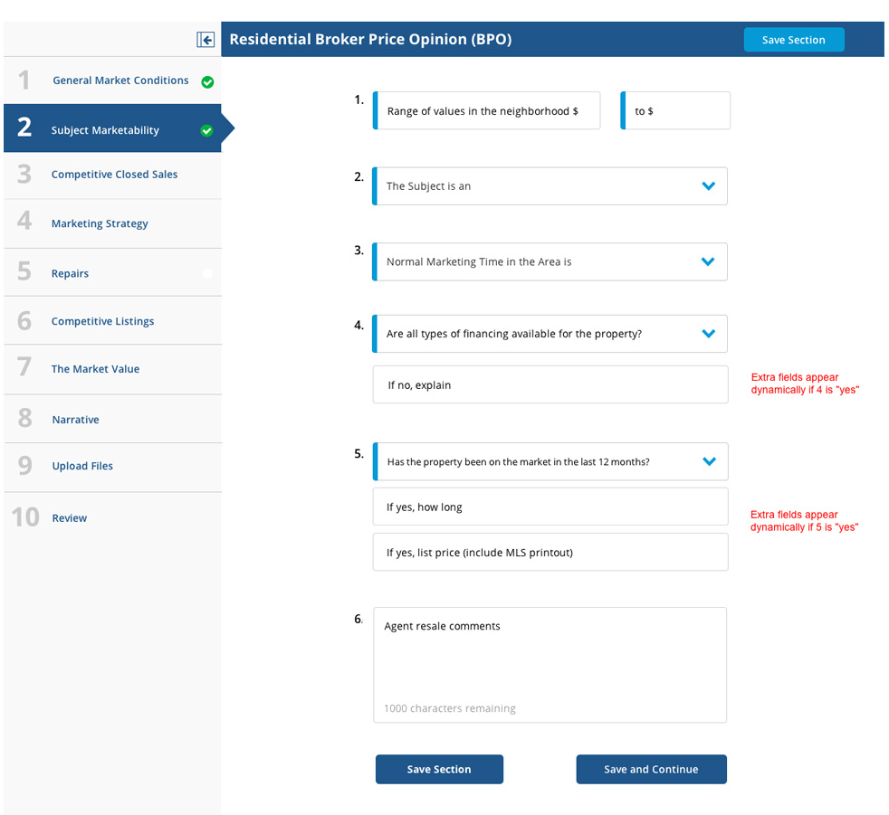
Form Layout
The screen above is the final page example layout. The items below in bold are the rules established from research above that were directly used to inform the design of this page.
1. Make easy to scan
2. Alignment and simplicity – eases the eye
3. Inline Error handling – points exactly where the error is. Says what the error is
4. Field is appropriate to data length
5. Complete button CTA stands out
6. Use example text – gives good samples of what to fill out
7. Long forms must be divided up to avoid attention fatigue
8. Use focus to show which field is active
9. Keep labels on screen after data is filled in – people can check their work
10. Make form fit media and work on media size
11. Group Related information
Prototype
A working clickable prototype was created from these layouts to be used as a sales and testing tool. This includes forms that can hold data and show focus, persistent labels, etc. This also contained all the pages of the entire form to get a sense of how well the form length would be tolerated.
Access to this prototype can be requested.
Recent Portfolios

Equator - Agent Portal Redesign

YLIXR - App & Website
An app & website for finding and connecting with the best service individuals.

Equator BPO (Broker Priced Opinion) Integration